

Emblem, logo and wordmark: what's the difference?
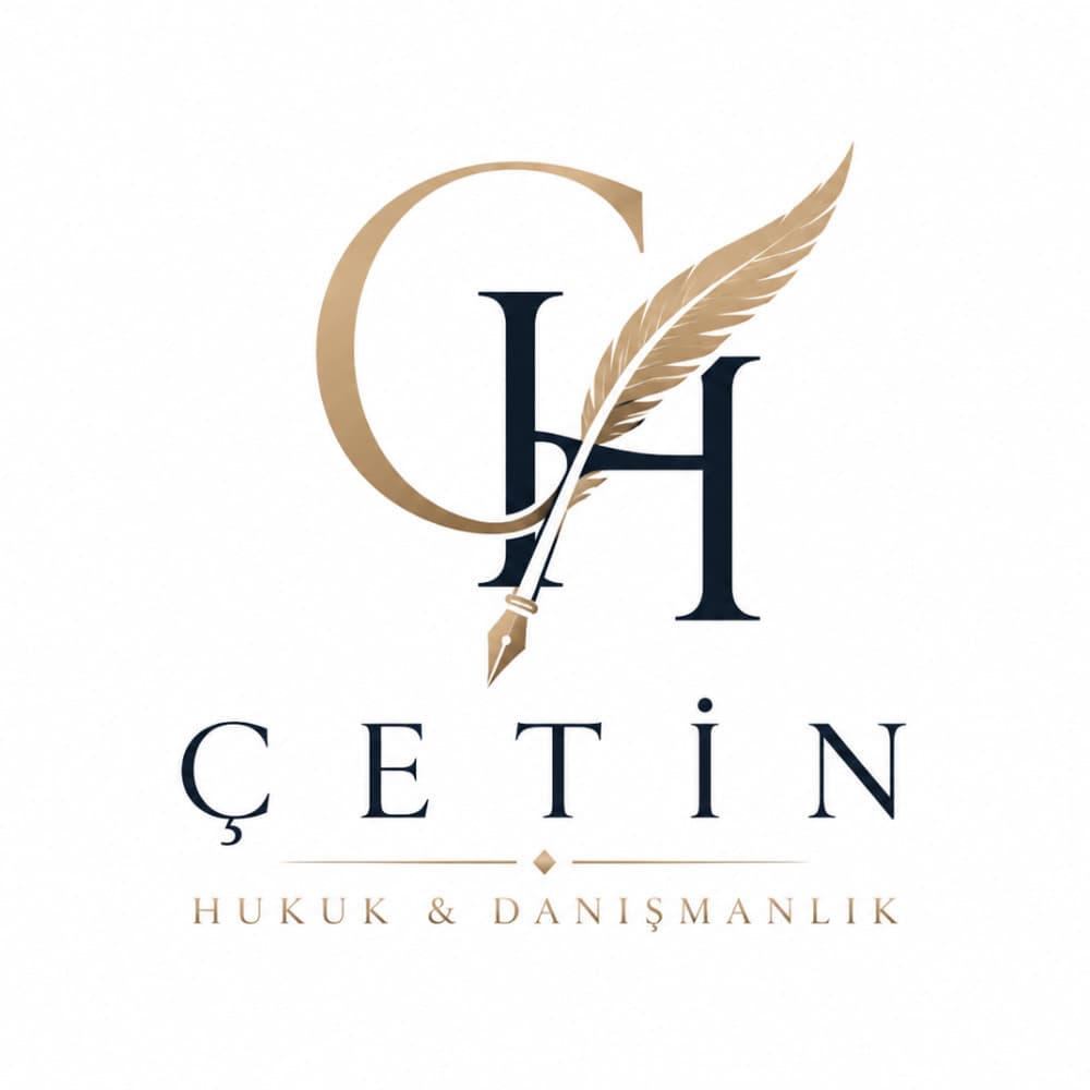
Think of "logo" as the family name. Inside that family, a wordmark is the brand name itself styled as the mark (Google, Coca-Cola). A symbol stands alone without text (Apple, Nike). An emblem locks the name inside a shape — you cannot separate the two without breaking the design.
Emblem types
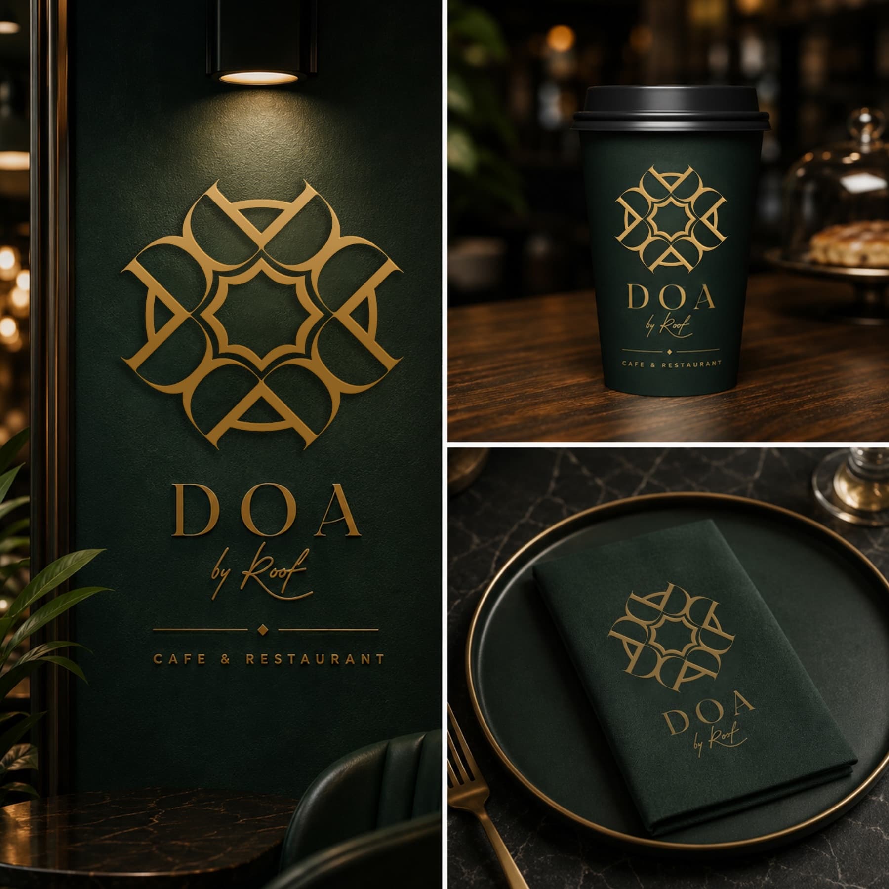
Badge: circular or shield-shaped, common in coffee and food brands. Seal: official, institutional feel — universities, chambers, associations. Crest: heraldic, heritage-driven — sports clubs, wineries. Modern emblem: simplified lines and bold type so it still reads at small sizes.
Advantages and drawbacks
Emblems feel established and trustworthy, and they sit beautifully in circular profile pictures. The drawback is scale: detail-heavy emblems blur on a favicon or an app icon, which is why a good emblem system also ships a simplified symbol-only version.
Want an emblem for your brand?
Run an emblem design contest: write a brief, compare original emblems from dozens of designers, pick your winner and receive vector files with full copyright.
Frequently asked questions
What is an emblem?
An emblem is a logo type where the brand name sits inside a symbol — a badge, seal or crest. Text and symbol are inseparable: Starbucks, Harley-Davidson and most universities and sports clubs use emblems.
What is the difference between an emblem and a logo?
"Logo" is the umbrella term for every brand mark. An emblem is one logo type: the name is locked inside the shape. In a combination mark the symbol and text can be used separately; in an emblem they cannot.
Which brands suit an emblem?
Emblems convey heritage, trust and belonging — ideal for coffee shops, restaurants, sports clubs, schools, artisanal and gastronomy brands. Digital-first tech brands usually do better with a minimal wordmark.
How do I get an emblem designed?
You can run an emblem design contest: write a brief, dozens of designers submit original emblems, you pick the winner and receive vector source files with full copyright.